
AI Data Visualization Inside Your Research Workspace
Charts that stay connected to your research.
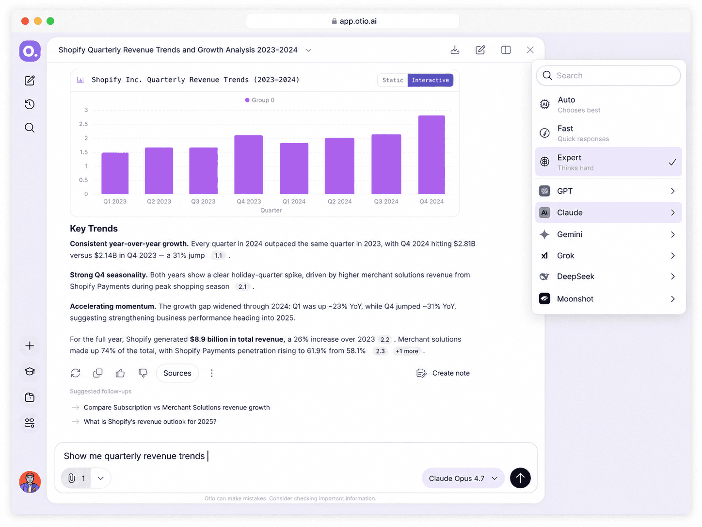
Generate visualizations from your CSV data in plain language. The chart and the documents that explain it live in the same workspace, answering questions together.
Last Updated June 18, 2026
Get Started Free
Trusted by 200,000+ professionals across 74 languages


Why charts outside your research workflow cost you time
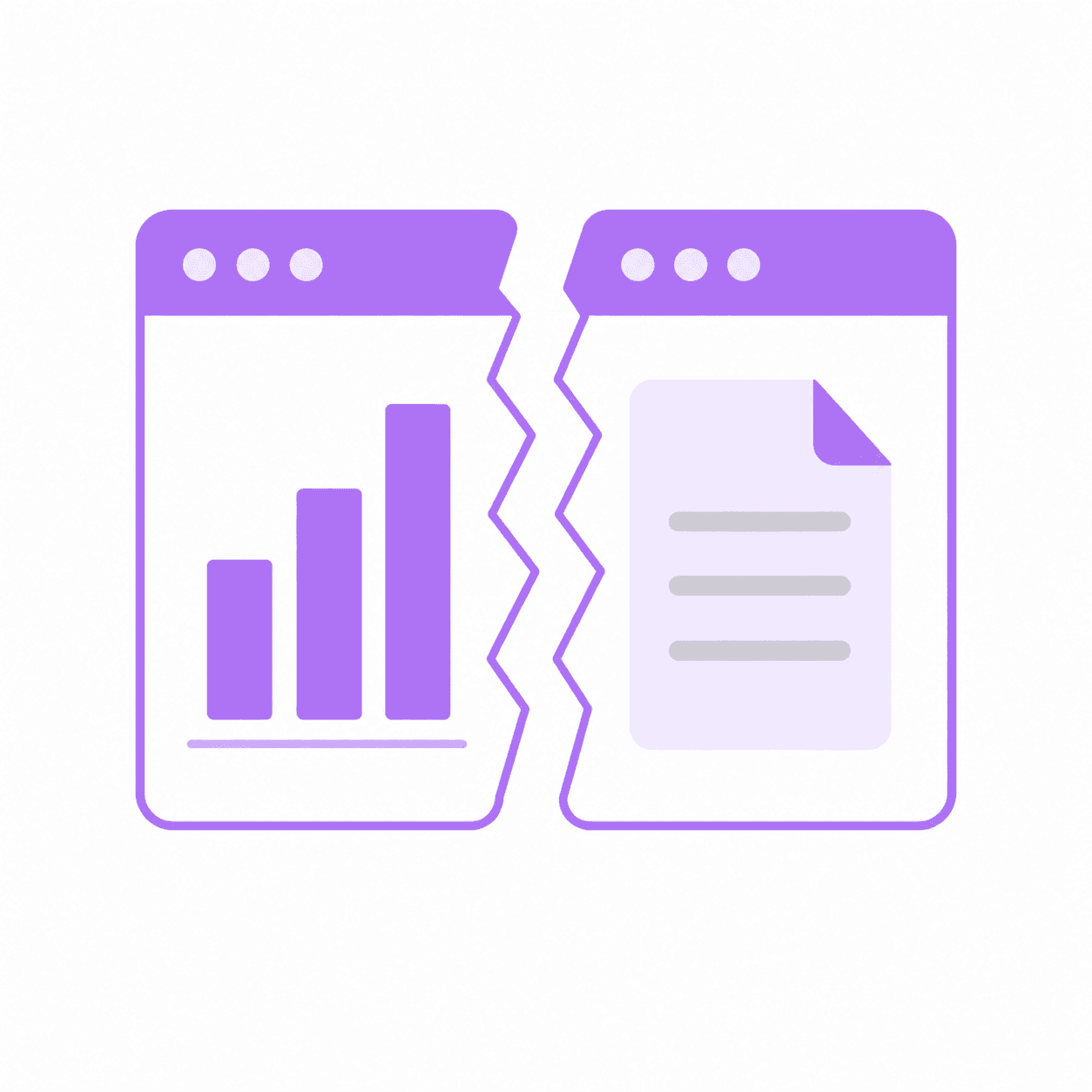
Charts you have to explain somewhere else
Most visualization tools give you a chart, then you export it and paste it into a document. The chart exists in one place, the report that explains what caused the trend exists in another, and you manually connect them every time someone asks a question.
When you need to revisit the data three weeks later, you're hunting through folders to find which CSV produced which chart and which paper explained the context.
Configuration overhead for one-off charts
Creating a chart in Excel means selecting cell ranges, choosing chart types, and formatting axes. Dedicated BI tools require account setup, data source connections, and a learning curve before you see your first visualization.
For research-scale needs — a single chart from survey results or experimental data — this overhead feels disproportionate to the task.
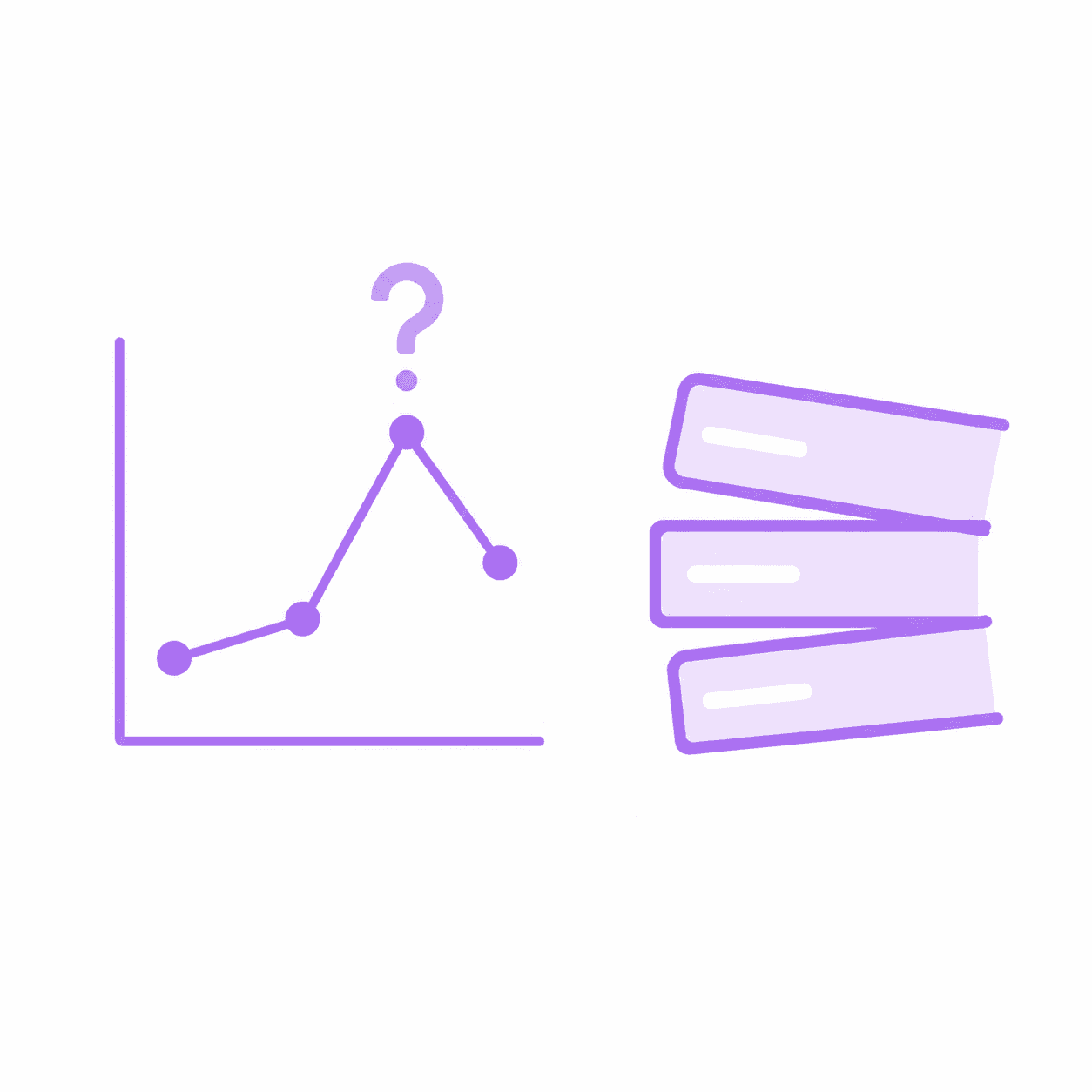
No way to ask follow-up questions across sources
The chart shows a spike in Q3. The report you uploaded last week explains the policy change that caused it. But your visualization tool can't connect those dots because it only sees the CSV, not your research library.
Answering "why does this trend look this way" means switching tools, opening documents manually, and losing your train of thought in the process.
What changes when the chart and the documents live in the same session
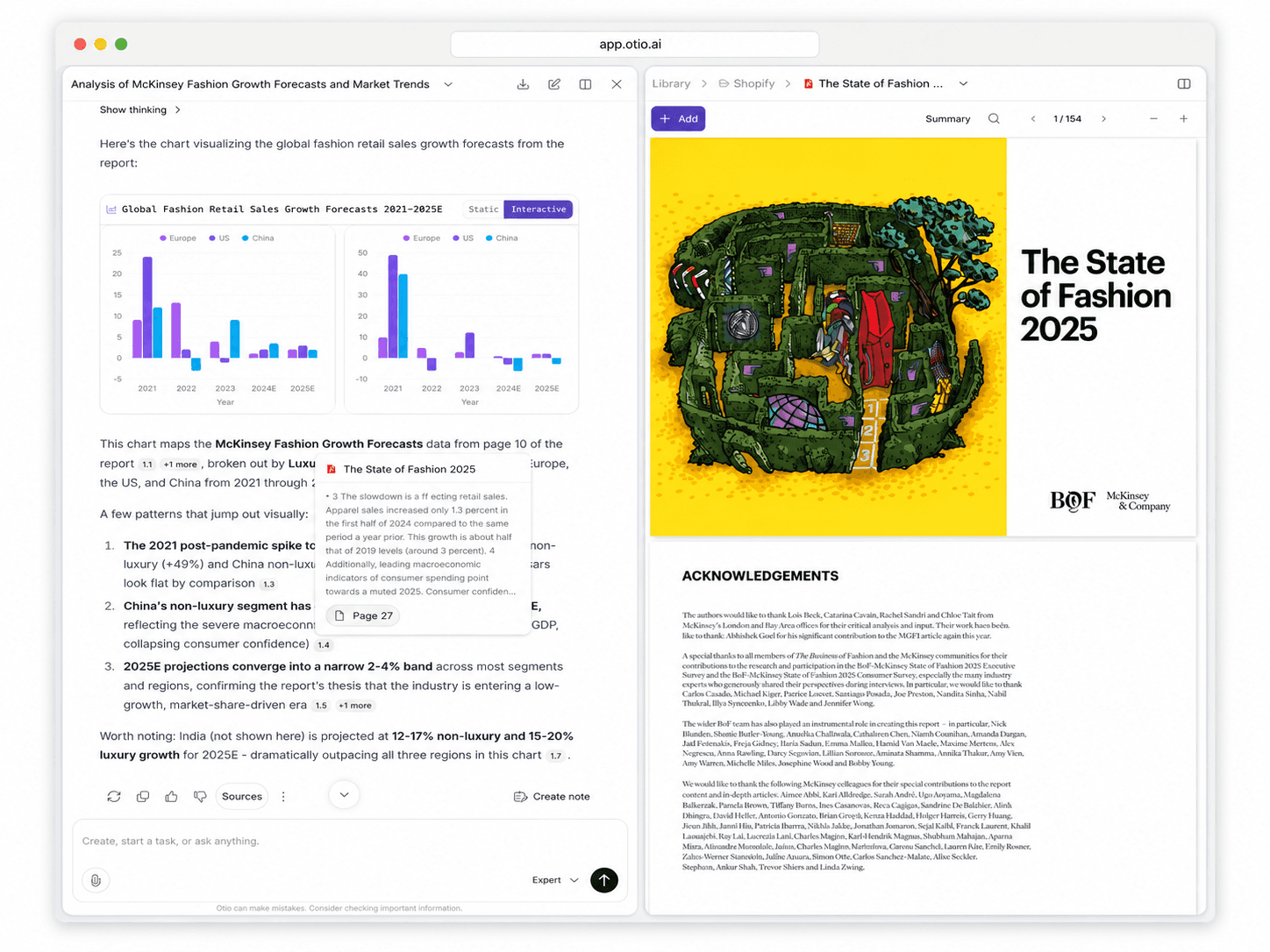
The chart and the paper that explains it, together
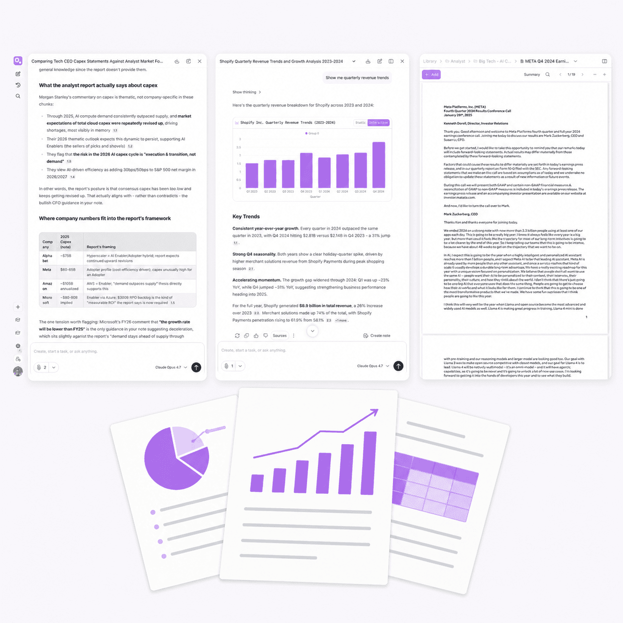
Upload your CSV and generate a chart with a plain-language question. Then ask Otio why the trend looks the way it does, and it pulls from the reports and papers you've already uploaded to give you context.
The visualization and the research that gives it meaning exist in one session. No exporting, no copy-paste, no switching tools to connect the dots.

Ask questions across your data and your documents
Generate a chart showing quarterly revenue trends from your CSV. Then ask which market conditions from your uploaded analyst reports correlate with the Q3 spike. Otio answers from both sources in the same workspace.
Cross-source questioning means the chart isn't an isolated output. It's part of a conversation that includes your entire research library.

Visualizations that stay in your workspace
When Otio generates a chart, it stays in your workspace alongside the CSV and the documents that contextualize it. Return to the session three weeks later and everything is still there, ready to answer new questions.
No hunting through export folders or trying to remember which dataset produced which chart. The visualization lives where your research lives.
Plain language, no configuration
Ask what you want to see and Otio generates the chart from your CSV. No dashboard to configure, no chart type dropdown, no axis formatting. Just the question and the visualization.
Then ask a follow-up question about the data or the context, and Otio keeps the conversation going without requiring you to switch tools or reframe your query.
See How Otio Keeps Charts and Context Together
Three steps from CSV to chart, inside your research
1
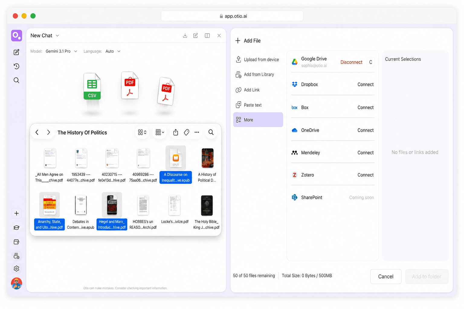
Upload your CSV and your research documents
Drag your CSV into Otio alongside the reports, papers, and transcripts that give your data context. Connect Google Drive, Zotero, Mendeley, Dropbox, OneDrive, or Box if your materials are already stored there.
Everything you upload stays in your workspace. The CSV, the chart it produces, and the documents that explain the trends all exist in one session.
2
Ask for the chart in plain language
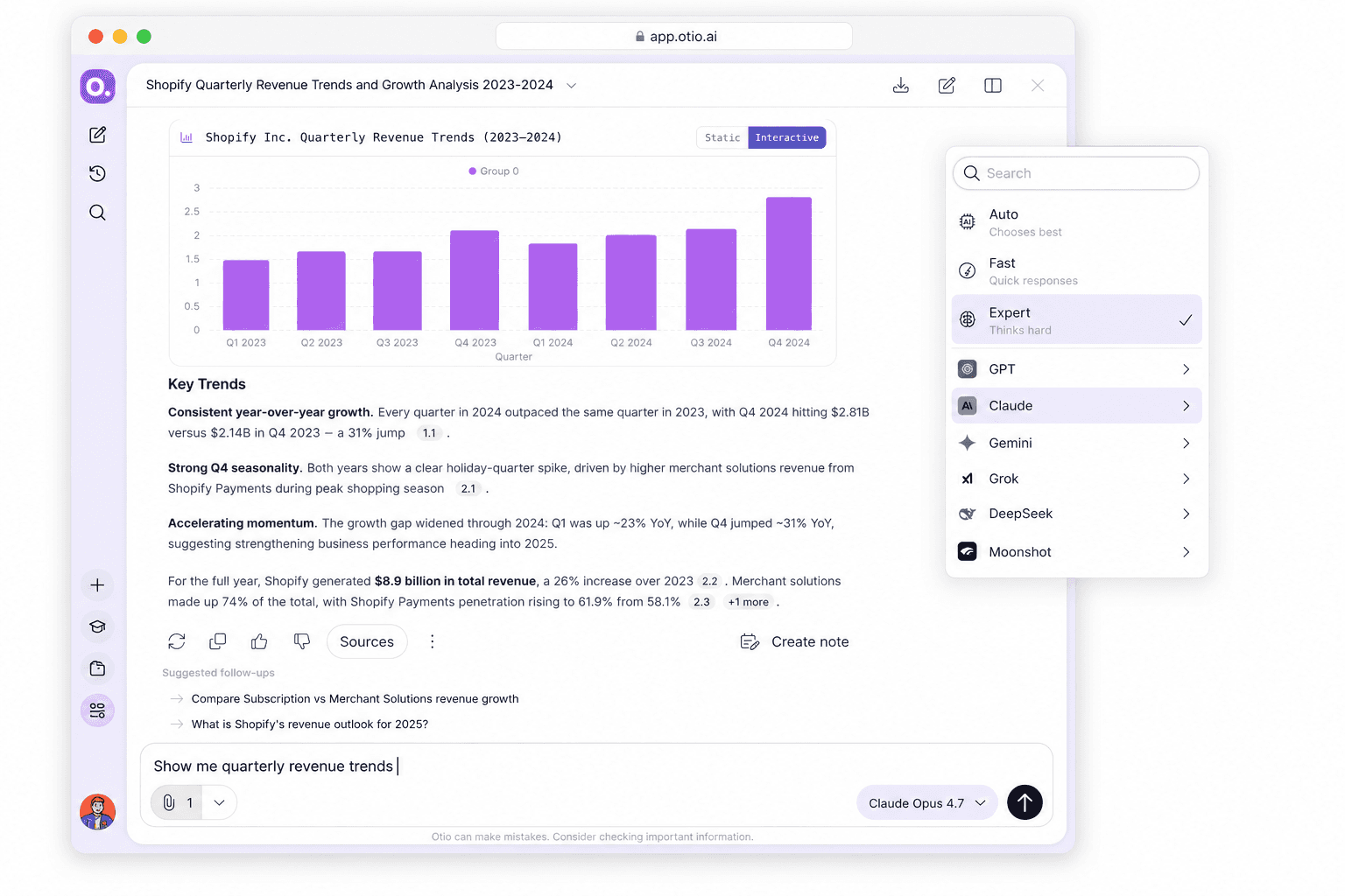
Type what you want to see: "Show me quarterly revenue trends" or "Create a bar chart comparing survey responses by region." Otio generates the visualization from your CSV without requiring you to configure chart types or select data ranges.
Choose which AI model generates the chart. Every model, every tier, all available in the same workspace.
3
Ask follow-up questions across your sources
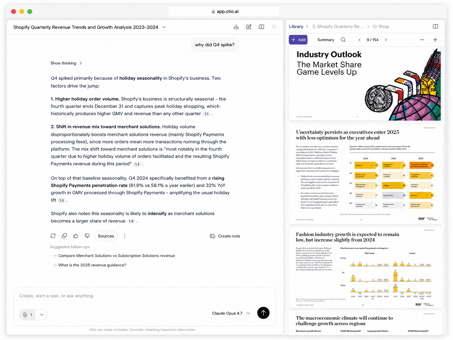
The chart shows a spike in Q3. Ask Otio why, and it pulls from your uploaded analyst reports to explain the market conditions that caused it. The visualization and the context answer questions together.
Keep asking. Refine the chart, explore the data, or dive into the documents that give the numbers meaning. Your train of thought stays on the rails because everything is in one workspace.
Who uses Otio for research-scale visualization
Based on Otio's onboarding data from the past 90 days, 522 of 1,750 users (30%) select 'Data & CSV analysis' as a primary use case, making chart generation one of the top 12 reasons people sign up for Otio.

Researchers: literature reviews with data visualizations
Upload 60 papers and a CSV of experimental results. Generate charts showing trends across your dataset, then ask Otio to pull key findings from the papers that explain what caused those trends.
Start your literature review from a structured synthesis that includes both the visualizations and the research context. Every answer cites the exact page and passage.
Financial analysts: market data with contextual reports
Upload quarterly earnings data as a CSV and analyst reports as PDFs. Generate charts showing revenue trends, then ask which market conditions from the reports correlate with the spikes and dips.
The chart and the context exist in one workspace. No exporting to PowerPoint, no manual cross-referencing between tools.

Consultants: client data with meeting transcripts
Upload client survey results and meeting transcripts. Generate visualizations showing response patterns, then ask Otio to pull themes from the transcripts that explain the data.
Build your deliverable from a structured summary that connects the numbers to the client's own words. Export when ready.

Graduate students: thesis data with source papers
Upload your thesis dataset and the papers that informed your methodology. Generate charts for your results section, then ask Otio to pull quotes and citations from the papers to support your analysis.
The visualization, the data, and the sources stay in one workspace. Return to the session weeks later and everything is still there.
What Otio is (and isn't) for AI data visualization
Otio is built for researchers, analysts, and students who need to visualize research data as one step inside a broader research project. It's not a replacement for Tableau, Power BI, ThoughtSpot, or Domo. If you need live data connections, multi-user dashboards, or enterprise reporting, those tools are the right choice.
What Otio handles
Plain-language chart generation from CSV data. Cross-source questioning that connects your visualizations to your uploaded documents. Permanent workspace storage so your charts and data stay together.
Every AI model available at every tier. No configuration, no dashboard setup, no formula writing. Just the question and the chart.
What Otio doesn't handle
Live data connections from CRMs or databases. Multi-user dashboard sharing for enterprise teams. Predictive analytics or advanced statistical modeling. Large-scale enterprise datasets that require BI infrastructure.
If your use case requires those capabilities, Otio isn't the right tool. We're transparent about scope because credibility matters more than claiming features we don't have.
Join 200,000+ Researchers and Analysts
What researchers and analysts are saying
"I 100% upload documents into our proprietary AI and it summarizes it and even gives me flow charts for trusts."
Finance professional
"Otio is really an excellent tool for understanding my papers. It is just like my personal librarian for the internet."
Neuroscience PhD
"Otio has been a game-changer for my thesis work. It's like having a personal research assistant available 24/7. Chatting with research articles and whole folders of content has saved me countless hours of reading and digging through papers."
Master's student
"Truly loved interface: it's very straightforward and intuitive vs other AIs. Especially vs having 100 tabs open and copy and pasting back and forth from ChatGPT."
Pharmaceutical researcher
Trusted by 200,000+ professionals across 74 languages
Connect your research library

Cloud storage integrations
Connect Google Drive, Dropbox, OneDrive, or Box. Your research materials sync directly into Otio, no manual uploads required.
The CSV, the charts, and the documents that give them context all live in one workspace, whether you upload them directly or pull them from cloud storage.
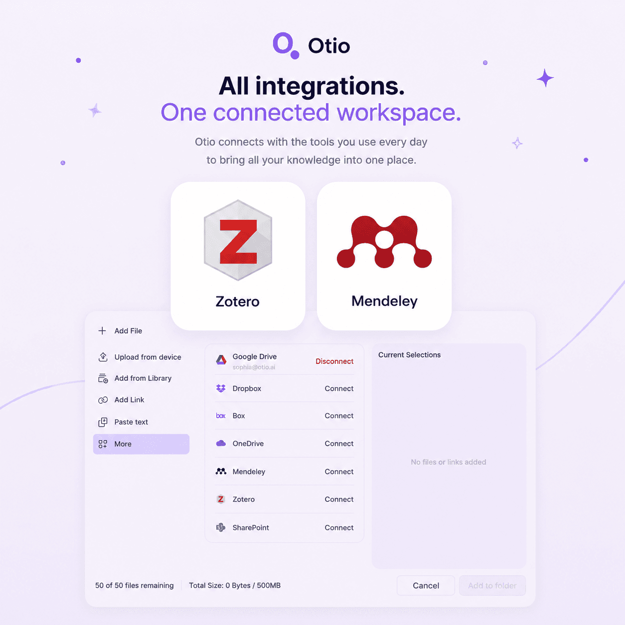
Reference management integrations
Connect Zotero or Mendeley. Your research library syncs into Otio so you can generate charts from your data and ask questions across your papers in the same session.
No exporting, no copy-paste. Your reference manager and your visualization workspace work together.

Upload anything
PDFs, articles, videos, podcasts, transcripts, and CSV files. Otio handles the formats researchers actually use, not just the ones BI tools expect.
Upload your materials however they exist. Otio turns them into a structured starting point for chart generation and cross-source questioning.
Is Otio a replacement for Tableau, Power BI, or similar BI tools?
No. Otio is built for research-scale visualization, not enterprise business intelligence. If you need live data connections from databases, multi-user dashboard sharing, or enterprise reporting, Tableau and Power BI are the right tools. Otio is for researchers, analysts, and students who need to generate charts from CSV data inside a research workspace, where the visualization stays connected to the documents that give it context.
What types of visualizations can Otio generate?
Can I ask plain-language questions to generate a chart, without writing formulas or configuring chart types?
Do my charts stay in my Otio workspace alongside my other research materials?
What size datasets can Otio handle for visualization?
Can I export my charts and data from Otio?
Can I use Otio to visualize data from multiple sources at once?
What AI models can I use for chart generation and data interpretation?
What to do next
🚀 Try Otio free
Create your first workspace and chat across your sources
⭐ Upgrade to Otio Go - $7/mo
Unlimited sources, all AI models, citations to exact page
All features. All AI models. Free to start.
Try Otio free