
Research Data Visualization
25 Best Research Data Visualization Tools for Students and Researchers
Compare 25 research data visualization tools by learning curve, chart types, statistical analysis, dashboards, collaboration, and publication readiness so you can choose the right fit.

If the goal is a quick class chart, use Excel or Google Sheets. If the goal is a defensible thesis, paper, or lab report, move the real analysis into R, Python, JASP, jamovi, SPSS, Stata, MATLAB, GraphPad Prism, or OriginPro, then use design or dashboard tools only when they fit the final audience.
The mistake is choosing the prettiest interface before deciding the output. A static journal figure, an exploratory scatterplot, an interactive public dashboard, and a statistical model diagnostic are different jobs. One tool rarely does all four well.
The best research data visualization tool depends on your output
Start with the deliverable:
Quick exploration: Excel, Google Sheets, RAWGraphs.
Clean public-facing charts: Datawrapper, Flourish, Infogram, Canva.
Interactive research dashboards: Tableau, Power BI, Looker Studio, Plotly Dash.
Reproducible analysis: Python with Matplotlib, Seaborn, or Plotly; R with ggplot2 in RStudio.
Statistical analysis plus figures: JASP, jamovi, SPSS, Stata, MATLAB, GraphPad Prism, OriginPro.
Specialized scientific visuals: QGIS for maps; Cytoscape for networks.
A visualization tool does not rescue weak analysis. Before styling anything, confirm the data cleaning steps, statistical method, sample size, missing data treatment, uncertainty intervals, axis scales, labels, and transformations.
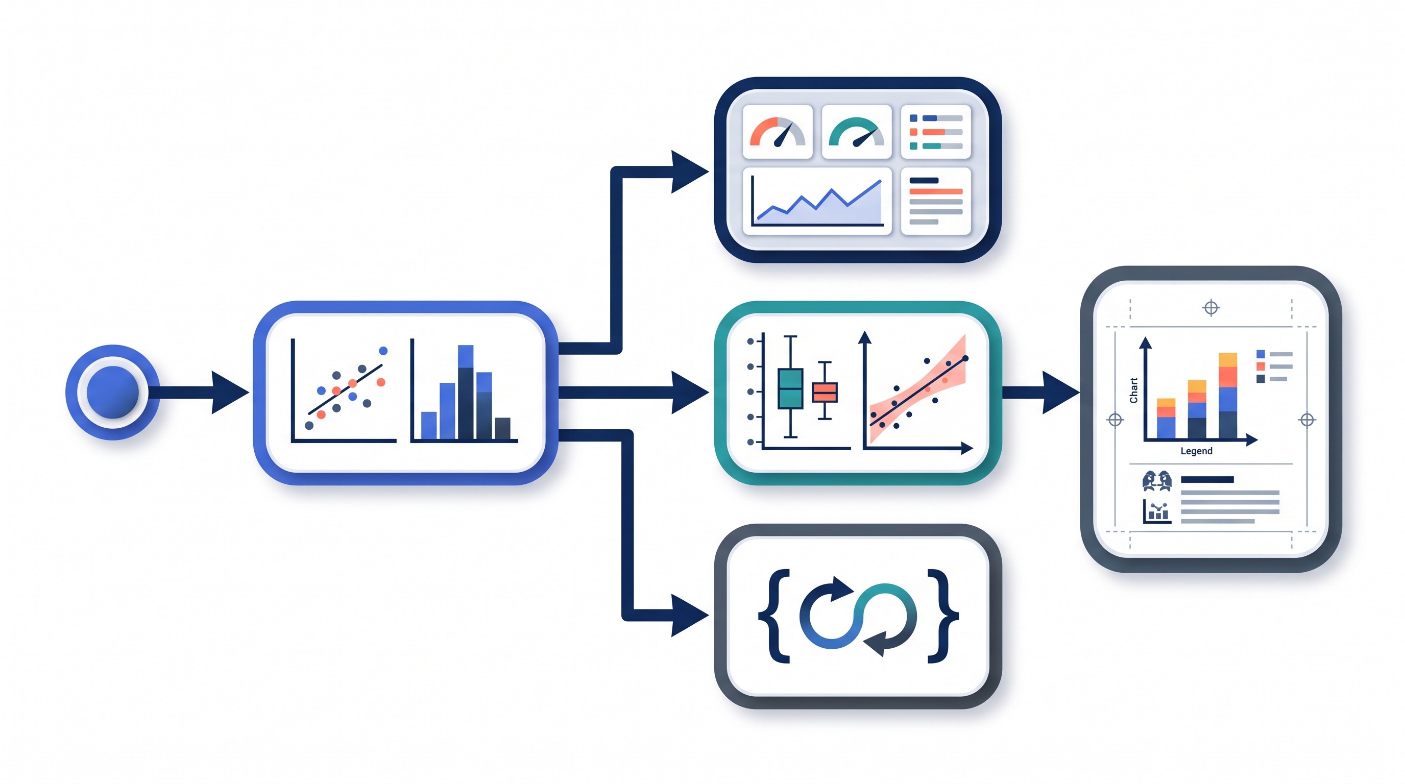
Use these criteria when choosing:
Data format: CSV, Excel, survey export, database, geospatial file, network file, image-derived data, lab instrument output.
Chart type: basic bar/line/scatter, distributions, maps, network graphs, survival curves, statistical intervals, dashboards.
Statistical workflow: whether the tool can run the required test or only draw the result.
Reproducibility: whether charts can be regenerated from raw data using scripts, saved settings, or documented steps.
Collaboration: browser sharing, version control, team permissions, comments, or static file handoff.
Export quality: PNG/JPEG for slides, SVG/PDF/EPS for vector publication, HTML for interactive work.
Accessibility: readable labels, color-safe palettes, alt text, and static alternatives for interactive visuals.
Privacy: where the data is stored, whether cloud upload is allowed, and whether sensitive human-subjects data can leave the institution.
Budget: free, education licenses, subscription tools, institutional access, or one-time desktop licenses.
Tool | Primary use case | Skill level | Strongest output | Main limitation |
|---|---|---|---|---|
Microsoft Excel | Quick exploratory charts | Beginner | Pivot charts, simple plots | Weak reproducibility |
Google Sheets | Collaborative lightweight charts | Beginner | Shared browser charts | Limited advanced stats |
Datawrapper | Publishable web charts and maps | Beginner | Clean explanatory charts | Less suited to local analysis |
Flourish | Interactive visual stories | Beginner-intermediate | Animated explainers | Static journal export can be awkward |
RAWGraphs | Unusual chart layouts from tables | Beginner-intermediate | Alluvial, bump, beeswarm-style visuals | Often needs polishing elsewhere |
Canva | Research infographics and posters | Beginner | Designed layouts | Not an analysis tool |
Tableau | Interactive dashboards | Intermediate | Filterable dashboards | Licensing and setup overhead |
Microsoft Power BI | Dashboards in Microsoft workflows | Intermediate | Business-style research dashboards | Aggregations need checking |
Looker Studio | Web-connected dashboards | Beginner-intermediate | Browser dashboards | Limited statistical graphics |
Infogram | Interactive reports and presentations | Beginner | Shareable reports | Communication over analysis |
Plotly Dash | Custom interactive web apps | Advanced | Research web applications | Requires coding and deployment |
Python Matplotlib | Scripted figure control | Intermediate-advanced | Precise static figures | Styling takes work |
Seaborn | Statistical plots in Python | Intermediate | Distributions and categorical plots | Less flexible for custom apps |
Plotly for Python | Interactive Python charts | Intermediate | HTML charts and exploratory visuals | Interactivity may not fit journals |
R with ggplot2 | Layered statistical graphics | Intermediate | Publication-ready statistical plots | Requires R fluency |
RStudio | R analysis and reporting environment | Intermediate | Reproducible scripts and reports | Not a chart library by itself |
JASP | GUI statistical analysis | Beginner | Common tests with readable output | Limited custom figure control |
jamovi | Modular GUI statistics | Beginner | Teaching-friendly statistical charts | Advanced work may need modules |
IBM SPSS Statistics | Structured survey/social-science stats | Beginner-intermediate | Standard statistical outputs | Less flexible graphics |
Stata | Command-based statistical research | Intermediate | Reproducible analysis graphs | Not an infographic tool |
MATLAB | Numerical and scientific computing | Intermediate-advanced | Engineering/scientific plots | Licensing and learning curve |
GraphPad Prism | Biomedical stats and figures | Beginner-intermediate | Polished life-science figures | Less flexible for unusual pipelines |
OriginPro | Technical plotting and fitting | Intermediate | Lab and engineering figures | Desktop workflow and learning curve |
QGIS | Geospatial analysis and maps | Intermediate | Research maps | Not general-purpose charting |
Cytoscape | Network visualization | Intermediate | Molecular, citation, interaction networks | Layout choices can mislead |
Best beginner-friendly tools for charts and exploratory research data
These tools are best when the question is still forming: What does the distribution look like? Are there obvious outliers? Did the survey export correctly? Which variables might be related?
They are not a substitute for a statistical workflow. Treat them as the sketchpad, not the final proof.

1. Microsoft Excel
Excel is still the fastest way for many students to turn a small dataset into a bar chart, line chart, scatterplot, or pivot chart. It works well for early inspection because the data and chart sit close together.
Its weakness is reproducibility. Manual edits, hidden filters, copied sheets, and chart formatting changes are easy to lose or misremember. For a thesis or publishable project, document every cleaning step or move the analysis into R, Python, Stata, SPSS, MATLAB, JASP, or jamovi.
Best for: quick class projects, small survey summaries, first-pass inspection.
2. Google Sheets
Google Sheets is useful when several people need to inspect, clean, or comment on a lightweight dataset in the browser. It covers basic charts and is easy to share with collaborators or instructors.
The tradeoff is depth. Advanced statistical graphics, model diagnostics, and publication-grade exports usually require another tool. Also check sharing permissions carefully if the dataset includes sensitive participant information.
Best for: collaborative early analysis, simple charts, shared project tracking.
3. Datawrapper
Datawrapper is built for clean, explanatory charts and maps with little or no coding. It is especially useful when a research finding needs to be embedded in a webpage, report, or public-facing brief.
Its workflow is more publishing-oriented than analysis-oriented. Use another tool to run the statistics, then bring the verified summary data into Datawrapper for communication.
Best for: polished web charts, policy briefs, public research communication.
4. Flourish
Flourish is strong for interactive stories, animated charts, scrollytelling, and exploratory presentations. It can make patterns easier for nontechnical audiences to explore.
Interactive visuals do not always translate to journal figures. If a paper requires static images, create a static alternative that preserves the main comparison without depending on hover states, animation, or filters.
Best for: presentations, public engagement, interactive research stories.
5. RAWGraphs
RAWGraphs is useful when ordinary spreadsheet chart menus are too narrow. It can turn tabular data into less-common visual forms such as alluvial diagrams, bump charts, streamgraphs, and other layouts.
Expect to polish the result elsewhere if it is going into a poster, paper, or formal report. RAWGraphs is often best as a bridge between raw data and a final design tool.
Best for: unusual chart types, visual exploration, design handoff.
6. Canva
Canva helps assemble research communication: posters, infographics, slide visuals, social graphics, and visual abstracts. It is a layout tool, not a statistical tool.
The risk is letting templates overpower the evidence. Do not turn a non-significant or uncertain result into a bold claim because the design looks clean. Bring in charts only after the analysis, scales, sample sizes, and uncertainty are settled.
Best for: posters, class presentations, visual summaries, outreach graphics.
Best dashboard and interactive visualization platforms for research projects
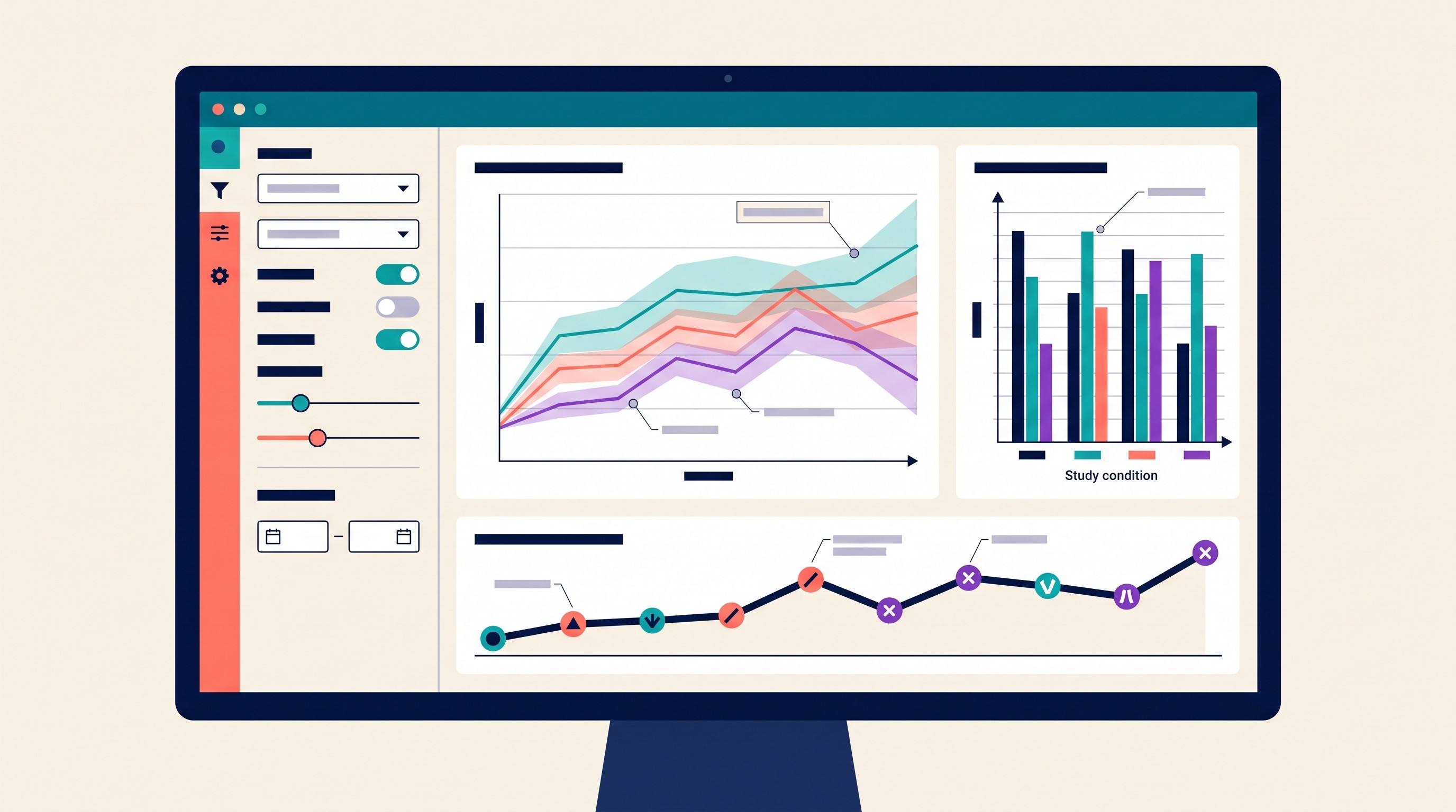
Dashboards are useful when the audience needs to filter, monitor, or compare subsets. They are less useful when the finding is a single result that should be read in a static paper figure.
Use dashboards for longitudinal monitoring, subgroup exploration, public reporting, administrative research, lab operations, or stakeholder communication. Use static figures for fixed arguments, journal submissions, and methods-driven reporting.
7. Tableau
Tableau is strong for interactive dashboards, filtering, and combining multiple data sources. It is often a good fit for institutional research, survey dashboards, public health reporting, and operational research.
The constraints are licensing, setup complexity, and the gap between dashboard output and static publication requirements. Also verify aggregations: a dashboard can quietly average, sum, or filter data in ways that change the interpretation.
Best for: polished interactive dashboards with multiple views and filters.
8. Microsoft Power BI
Power BI is practical for researchers already working inside Microsoft data systems. It can connect to spreadsheets, databases, and organizational reporting workflows, then present interactive dashboards with controlled sharing.
Its modeling layer needs careful review. Automatically aggregated fields, relationships between tables, and row-level permissions can affect results. For research use, keep a data dictionary and validate dashboard numbers against the source analysis.
Best for: Microsoft-heavy teams, administrative research, recurring reports.
9. Looker Studio
Looker Studio is useful for browser-based dashboards connected to online sources. It fits projects that need lightweight web reporting rather than deep statistical graphics.
It is less suited to offline workflows or specialized academic visualization. Use it for communication after the analysis has been checked elsewhere.
Best for: simple live dashboards, web analytics-style reporting, shareable browser views.
10. Infogram
Infogram sits between dashboard tools and design tools. It is good for interactive charts, infographics, and presentation-ready reports.
Its strength is communication, not rigorous analysis. Use it to explain verified results, not to decide which statistical model is appropriate.
Best for: interactive reports, visual briefs, stakeholder-facing summaries.
11. Plotly Dash
Plotly Dash is for researchers who need a custom web application around interactive charts. It is powerful when the dashboard is part of the research product itself: a model explorer, data browser, simulation interface, or internal lab tool.
The cost is technical. Dash requires programming, application structure, hosting, and maintenance. If the project only needs a few filters and charts, Tableau or Power BI may be faster.
Best for: custom Python-based research apps and interactive analysis tools.
Best coding tools for reproducible research charts
Code-first visualization matters when figures will be regenerated, audited, shared, or updated. A script records what happened: which file was loaded, which rows were filtered, which variables were transformed, and how the chart was exported.
For serious research, pair scripts or notebooks with version control, a data dictionary, and saved export settings. That is how a figure becomes reproducible rather than decorative.
12. Python Matplotlib
Matplotlib is the foundation of much Python visualization. It gives precise control over axes, annotations, subplots, figure dimensions, and export formats.
The tradeoff is that good styling is deliberate. Default charts may need careful work before they are ready for a paper, but the control is valuable when exact sizing or repeated figure generation matters.
Best for: precise static figures, reproducible Python analysis, custom layouts.
13. Seaborn
Seaborn builds on Matplotlib and is designed for statistical graphics in Python. It is convenient for relational plots, distribution plots, categorical comparisons, heatmaps, and quick exploratory visuals.
It is not a full dashboard framework. For interactive applications, combine Python analysis with Plotly, Dash, Streamlit, or another app layer.
Best for: statistical exploration and clean Python charts.
14. Plotly for Python
Plotly for Python is strong when interactive charts are part of the workflow. It supports hover labels, zooming, filtering patterns, and HTML export.
The tradeoff is journal compatibility. Interactive charts are useful for exploration and web reports, but many papers still need static figures. Check whether the final venue accepts interactive supplements or requires static files.
Best for: interactive Python charts, exploratory notebooks, web-embeddable visuals.
15. R with ggplot2
ggplot2 is one of the strongest tools for layered statistical graphics. Its grammar of graphics approach makes it natural to map variables to position, color, shape, facets, and statistical summaries.
The main requirement is R knowledge. For reproducibility, manage package versions and keep figure code with the analysis code.
Best for: statistical plots, publication figures, reproducible academic workflows.
16. RStudio
RStudio is not a standalone chart library. It is an environment for writing R scripts, running analysis, organizing projects, generating reports, and working with packages such as ggplot2.
Its value is workflow. A student can keep data import, cleaning, statistical modeling, visualization, and report generation in one project folder rather than scattering work across files.
Best for: R-based research projects, reproducible reports, thesis workflows.
If the project involves AI-assisted analysis, compare tools carefully. Otio has a separate guide to AI visualization tools for data, while researchers working directly with tabular files may also want a broader comparison of AI tools for CSV analysis and data-heavy workflows.
[[OTIO_INLINE_PROMO:%7B%22title%22%3A%22Need%20a%20first-pass%20chart%20from%20your%20research%20CSV%3F%22%2C%22description%22%3A%22Add%20your%20CSV%20to%20Otio%20to%20explore%20chart%20ideas%20alongside%20the%20notes%2C%20papers%2C%20and%20source%20links%20that%20explain%20your%20variables.%22%7D]]
Best statistical software for research charts and analysis
Statistical software is the right category when the chart is tied to a test, model, estimate, confidence interval, or diagnostic. The visual should reflect the analysis, not sit beside it as decoration.
Statistical significance alone should not determine chart design. Show effect sizes, confidence intervals, sample sizes, missing data, and practical or clinical meaning where appropriate.
17. JASP
JASP is approachable for students who need common statistical tests without writing code. Its spreadsheet-style interface and readable output make it useful for introductory statistics, psychology, social science, and methods courses.
It is best for common analyses and understandable figures. Advanced customization, specialized models, or highly formatted publication figures may require another tool.
Best for: students learning statistics and producing standard analysis outputs.
18. jamovi
jamovi is another beginner-friendly statistical package with a modular interface. It is useful for teaching, student projects, and common statistical workflows.
Its modularity is a strength, but advanced work may depend on add-on modules or export to R. For complex research designs, confirm that the method and figure type are supported before committing.
Best for: student statistics, modular analysis, approachable GUI workflows.
19. IBM SPSS Statistics
SPSS is widely used in structured survey analysis, social sciences, education, health services, and applied research settings. Its menus make familiar procedures accessible, especially for users who do not want to code.
Graphics are less flexible than code-first workflows. For polished or unusual figures, researchers often export results and recreate final visuals elsewhere.
Best for: structured survey datasets, standard social-science analysis, institutional workflows.
20. Stata
Stata is strong for reproducible statistical analysis through commands and do-files. It is common in economics, public health, policy research, epidemiology, and social science.
Its graphing system is capable, but its main strength is analytical consistency. If every cleaning step, model, and graph command is saved, the work is much easier to audit than a manually edited spreadsheet.
Best for: command-based statistical research and reproducible applied analysis.
21. MATLAB
MATLAB is well suited to numerical, engineering, signal-processing, and scientific visualization workflows. It handles matrix-heavy analysis, simulations, and technical plots well.
The tradeoffs are licensing and learning curve. It is most attractive when the research already depends on MATLAB for computation, modeling, or instrument-linked workflows.
Best for: engineering, numerical modeling, scientific computing, lab data analysis.
Best tools for publication-ready scientific figures
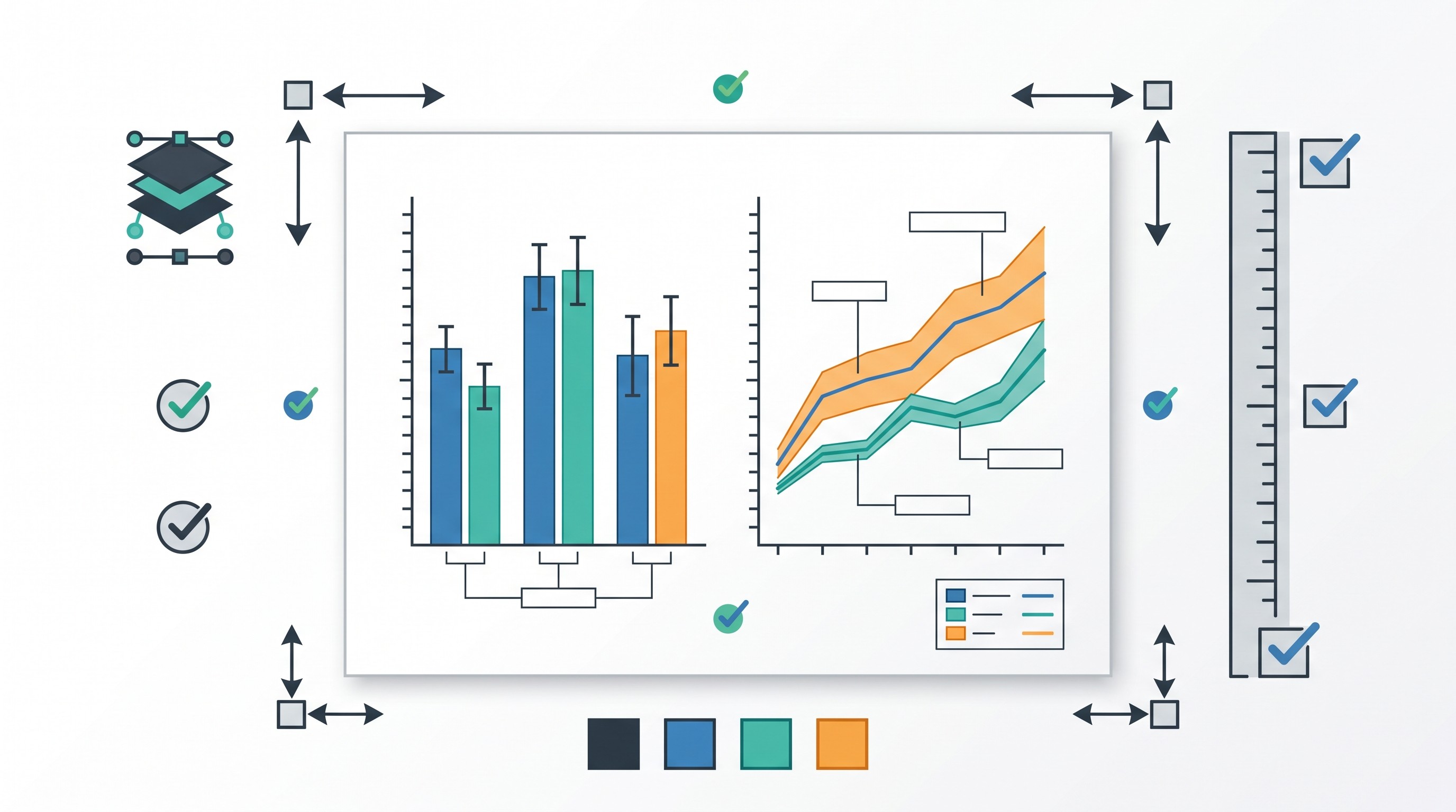
Publication-ready does not mean “pretty.” It means the figure is accurate, legible at journal size, exported in the required format, and defensible from raw data to caption.
A polished but misleading figure is still a bad figure. Keep transformations transparent, use appropriate scales, show uncertainty, and write captions that define every encoding.
22. GraphPad Prism
GraphPad Prism is well suited to biomedical and life-science research where common statistical tests and polished figures sit close together. It is popular for dose-response curves, grouped comparisons, survival curves, and lab-style figures.
Its limitation is flexibility. Unusual designs, fully scripted pipelines, or large automated reporting workflows may be better in R, Python, MATLAB, or a command-based statistics package.
Best for: biomedical figures, common lab analyses, polished life-science plots.
23. OriginPro
OriginPro is useful for technical, engineering, chemistry, physics, and laboratory data. It offers extensive plotting, curve fitting, peak analysis, and scientific graph customization.
It has a real learning curve. It also fits a desktop workflow better than a collaborative browser workflow.
Best for: lab data, technical plots, curve fitting, engineering figures.
24. QGIS
QGIS is the strongest fit on this list for geospatial research maps and spatial analysis. It supports spatial layers, projections, shapefiles, GeoJSON, raster data, and map composition.
It is not a general-purpose statistical charting tool. Use it when location is central to the analysis, not because a project happens to mention place names.
Best for: geospatial analysis, research maps, environmental and urban data.
25. Cytoscape
Cytoscape is useful for network and interaction visualizations: molecular networks, biological pathways, citation networks, systems relationships, and other node-edge data.
Network layouts can strongly affect interpretation. Avoid treating spatial closeness as meaningful unless the layout or metric supports that reading. Always explain what nodes, edges, size, color, and clustering mean.
Best for: network science, molecular interaction maps, citation or relationship graphs.
Before submitting figures, check:
Target journal dimensions and column widths.
Required resolution for raster images.
Whether vector export is accepted or preferred.
Font size after reduction.
Color profile and color-blind readability.
Line weights and marker sizes.
Whether interactive elements need a static equivalent.
Whether captions define all abbreviations, encodings, and statistical intervals.
How to choose among the 25 research data visualization tools
Choose by workflow stage first.
If the task is to inspect raw data, start with Excel, Google Sheets, Seaborn, ggplot2, or RAWGraphs. If the task is to test a hypothesis, use statistical or code-based software. If the task is to communicate verified results, use Datawrapper, Flourish, Infogram, Canva, Tableau, or Power BI. If the task is to publish a figure, prioritize GraphPad Prism, OriginPro, ggplot2, Matplotlib, MATLAB, QGIS, or Cytoscape depending on the data type.
Choose by data structure next:
Tidy tables: Excel, Sheets, R, Python, JASP, jamovi, SPSS, Stata.
Repeated measures or modeled data: R, Python, Stata, SPSS, MATLAB, GraphPad Prism.
Survey data: SPSS, Stata, R, Power BI, Tableau.
Geospatial data: QGIS, Tableau, Datawrapper for simpler maps.
Networks: Cytoscape, R/Python network libraries, depending on analysis needs.
Time series: R, Python, MATLAB, Tableau, Power BI.
Laboratory measurements: GraphPad Prism, OriginPro, MATLAB, Python, R.
Choose a reproducible workflow when figures will be updated, shared, audited, or generated from a thesis or paper dataset. That usually means scripts, saved project files, documented transformations, and stable source data. For larger projects, good research data management matters as much as the charting tool.
Check export requirements before committing. Slides can usually tolerate PNG or JPEG. Journals and books often need SVG, PDF, EPS, TIFF, or high-resolution raster files. Interactive results may require HTML, hosted links, or a static fallback.
AI can help during exploration, especially when the task is asking questions about a dataset and generating first-pass charts. Otio’s AI data visualization workflow supports CSV analysis and chart-based outputs inside a research workspace, alongside PDFs, notes, links, and other project materials. Treat those outputs as drafts: verify the transformation, labels, scale, chart type, and interpretation before using them in academic work.
A practical stack for most students and researchers looks like this:
Initial inspection: Excel or Google Sheets.
Real analysis: R, Python, JASP, jamovi, SPSS, Stata, MATLAB, GraphPad Prism, or OriginPro.
Final communication: ggplot2, Matplotlib, Prism, OriginPro, Datawrapper, Tableau, Power BI, Canva, or a journal-specific figure workflow.
Project organization: keep the dataset, code, figures, captions, and notes together. If the broader workflow is messy, compare dedicated research tools for students rather than adding another chart app.
Use this final checklist before making the figure look nice:
Define the audience.
State the message in one sentence.
Choose the chart type before styling.
Show uncertainty where the claim depends on estimates.
Label axes, units, groups, and sample sizes.
Avoid misleading scales and decorative 3D effects.
Test color accessibility.
Export at the required size and format.
Preserve the underlying data, code, and settings.
Keep a static version of any interactive figure.
FAQ
Q: What is the best data visualization tool for students?
A: Excel, Google Sheets, JASP, and jamovi are the easiest starting points for common student projects. Choose based on whether the assignment requires quick charts, statistical testing, collaboration, or reproducible code.
Q: What tool is best for publication-quality research figures?
A: GraphPad Prism, OriginPro, R with ggplot2, and Python with Matplotlib are strong options. Check the target journal’s file format, dimensions, resolution, color, and font requirements before exporting.
Q: Should researchers use Python or R for data visualization?
A: Both support reproducible, customizable research graphics. R with ggplot2 is especially convenient for statistical reporting, while Python is strong when visualization is part of a broader data-processing or application workflow.
Q: Can AI create research charts from a dataset?
A: AI tools can suggest or generate charts, but researchers must verify the data transformation, chart type, labels, scales, uncertainty, and interpretation. AI-generated figures should not replace statistical review or reproducible analysis.
[[OTIO_FOOTER_PROMO:%7B%22title%22%3A%22Ready%20to%20organize%20your%20visualization%20workflow%3F%22%2C%22description%22%3A%22Bring%20your%20datasets%2C%20papers%2C%20notes%2C%20and%20chart%20decisions%20into%20Otio%2C%20then%20review%20AI-generated%20visuals%20before%20using%20them%20in%20academic%20work.%22%7D]]