
Data Workflows
18 Best Tools for Survey Data Cleaning and Analysis
Compare 18 tools for cleaning survey files, coding open-ended responses, running statistical tests, and building reliable visualizations. Find the best fit by workflow, skill level, and reproducibility needs.

The best survey data tool depends on the job
If the survey export is messy, start with a cleaning tool. If the question is inferential, move to a statistical package. If the valuable data is in open-ended answers, use qualitative coding software. If the audience needs repeatable reporting, build a dashboard from an analysis-ready file, not from the raw export.
The common mistake is asking one tool to do everything. A good survey workflow usually has layers: collect responses, preserve the raw export, clean and code the data, run the analysis, then visualize only the results you trust.
Evaluate tools against the work they must survive: CSV, XLSX, SAV, JSON, and API imports; missing-data handling; duplicate detection; recoding; weighting; statistical depth; reproducibility; collaboration; privacy; and cost. Data cleaning is not clerical work: a 2026 benchmark paper describes cleaning as a step that “directly influenc[es] the reliability and accuracy of downstream analytics” (DOI).
Tool | Primary use | Technical level | Strongest survey workflow | Main limitation |
|---|---|---|---|---|
OpenRefine | Cleaning messy tables | Low-medium | Standardizing text labels and near-duplicates | Not a statistical analysis environment |
Excel Power Query | Spreadsheet data preparation | Low-medium | Refreshable imports and transformations | Complex logic can become hard to audit |
Python with pandas | Scripted cleaning and analysis prep | High | Large, repeatable validation pipelines | Requires programming discipline |
R with tidyverse | Scripted prep and statistical workflow | Medium-high | Reproducible survey cleaning before analysis | Steeper start for spreadsheet users |
Qualtrics | Survey collection and response management | Low-medium | Complex survey design plus connected exports | Advanced features depend on plan/configuration |
SurveyMonkey | Survey collection and simple summaries | Low | Fast questionnaires and basic reporting | Native analysis is limited for complex research |
NVivo | Qualitative coding | Medium | Thematic coding of open-ended responses | Complements, not replaces, quantitative analysis |
MAXQDA | Mixed-methods qualitative analysis | Medium | Coding text alongside demographic variables | Overkill for a few short responses |
ATLAS.ti | Collaborative qualitative coding | Medium | Linking excerpts, codes, themes, and memos | Setup and licensing may exceed small projects |
IBM SPSS Statistics | Statistical analysis | Low-medium | Menu-driven descriptives, crosstabs, regression | Subscription cost and reproducibility tradeoffs |
Stata | Statistical analysis | Medium-high | Command-based survey analysis and modeling | Less friendly for point-and-click users |
SAS | Enterprise statistical analysis | High | Regulated, institutional, large-scale analysis | Licensing/admin overhead |
jamovi | Beginner statistics | Low | Free, spreadsheet-like common tests | Advanced customization may require modules |
JASP | Accessible statistical analysis | Low | Frequentist and Bayesian analysis with clear output | Not ideal for complex production pipelines |
Tableau | Visualization dashboards | Medium | Interactive stakeholder dashboards | Clean measures must be defined elsewhere |
Microsoft Power BI | BI dashboards | Medium | Microsoft-centered reporting and data models | Permissions and model design can distort results |
Looker Studio | Lightweight web reporting | Low-medium | Browser-based reports from cloud data | Limited for complex transformations |
Flourish | Presentation graphics | Low | Interactive storytelling from prepared summaries | Visualization layer only |
Best tools for cleaning and preparing survey data
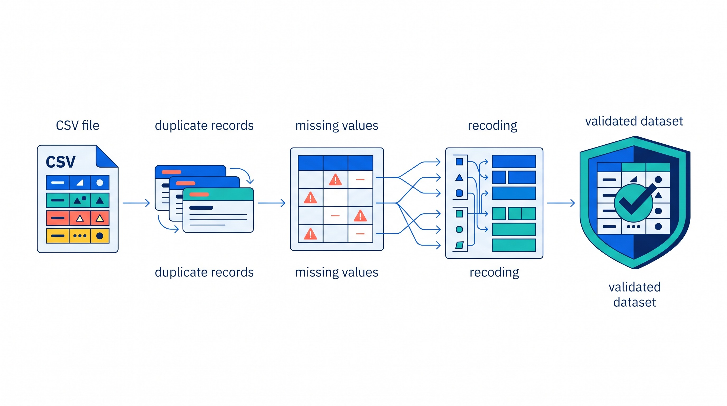
Survey exports fail in predictable ways: inconsistent labels, hidden missing values, duplicate respondents, free-text variants, broken skip logic, and date or numeric columns imported as text. The cleaning tool should make those failures visible before you touch the analysis.
1. OpenRefine
OpenRefine is best for inspecting inconsistent text values, clustering near-duplicates, and applying repeatable transformations to tabular data. The University of California Irvine library guide describes it as a “free, open-source tool designed for handling messy data” and cleaning/transformation work (UCI Libraries).
Use it when response labels vary because of capitalization, punctuation, spelling, or copy-paste errors: “United States,” “USA,” “U.S.A.,” and “US,” for example. Its faceting and clustering workflow is especially useful when you need to inspect categories before collapsing them.
Do not treat OpenRefine as the whole analysis environment. It is strongest before SPSS, R, Python, Tableau, or Power BI, when the job is to make a dataset coherent enough to analyze.
2. Excel Power Query
Excel Power Query is the best cleaning option for researchers already living in spreadsheets who need a visual, refreshable workflow. Instead of manually editing cells, you import a CSV or workbook, define steps such as splitting columns, replacing values, changing data types, filtering rows, and merging tables, then refresh those steps when a new export arrives.
That refreshability matters. Manual spreadsheet edits are easy to forget and hard to reproduce. Power Query gives you a visible transformation trail, though complex logic still needs documentation in a codebook or methods note.
Use it for small to medium survey projects where Excel remains the reporting hub. Avoid it when statistical modeling, version control, or automated validation tests become central.
3. Python with pandas
Python with pandas is best for large, repeatable cleaning pipelines. It handles recoding, joins, validation rules, calculated variables, reshaping, duplicate checks, and automated quality reports in a script rather than a point-and-click history.
This is the right choice when the survey file updates repeatedly, when multiple exports must be joined, or when cleaning rules need to run identically across waves. A typical pipeline might import raw CSVs, normalize column names, enforce expected response ranges, flag speeders, generate missingness summaries, and export an analysis-ready file.
The weakness is not the tool; it is governance. Poorly documented notebooks can become as opaque as messy spreadsheets. Keep raw files immutable, name every derived variable clearly, and write the cleaning logic as if someone else will audit it.
4. R with tidyverse
R with tidyverse is best when survey preparation and statistical analysis belong in the same transparent workflow. Packages such as dplyr, tidyr, stringr, and readr support readable data-cleaning scripts, and R’s statistical ecosystem makes it natural to continue into descriptive tables, models, plots, and reports.
R is especially strong for academic and policy research where methods sections, reproducibility, and code review matter. It also fits projects that will later use survey weights, regression models, or publication-ready figures.
The tradeoff is onboarding. Spreadsheet users may move faster in Power Query at first. R pays off when the cleaning rules must be explicit, reusable, and tied to the final analysis.
If the data is already in CSV or spreadsheet form and you want a quick AI-assisted inspection before writing the final cleaning script, Otio’s AI data analysis workspace can help summarize structured files and generate charts. Treat that as exploratory review, not a substitute for a validated script or statistical package.
Best tools for survey collection and response-data management
Survey collection tools are not just form builders. They define question wording, skip logic, randomization, quotas, consent flows, embedded data, export structure, and often the metadata needed to analyze responses later.
5. Qualtrics
Qualtrics is best when survey design, branching logic, response management, exports, and downstream analysis need to stay connected. It is widely used in academic, enterprise, healthcare, and customer-experience settings because complex questionnaires often need more than a simple form.
Choose Qualtrics when the instrument includes display logic, embedded variables, panels, multilingual versions, repeated waves, or collaboration among researchers. Before committing, verify the plan’s export formats, API access, weighting options, text analysis features, permissions, and data-residency requirements.
The main risk is assuming the platform’s built-in reporting will answer every research question. For serious inference, you will often export to SPSS, Stata, R, Python, SAS, or a survey-specific analysis platform.
6. SurveyMonkey
SurveyMonkey is best for straightforward survey creation, quick distribution, and built-in summaries. It works well for pulse surveys, event feedback, customer questionnaires, and lighter internal research where the main deliverable is a set of descriptive results.
You will outgrow its native analysis when the project needs complex recoding, weighting, respondent-level joins, advanced statistical tests, or custom dashboards. At that point, use SurveyMonkey for collection and move the export into a cleaning and analysis workflow.
The practical rule: if the survey is simple and the audience needs quick charts, SurveyMonkey may be enough. If the survey informs research claims, policy decisions, or product strategy, plan the export workflow before launch.
For broader collection-tool comparisons, Otio also has a separate guide to data collection tools for research.
Best tools for coding open-ended survey responses
Open-ended responses create a different problem from multiple-choice data. You are not just cleaning values; you are deciding what concepts appear in text and how consistently coders apply those concepts.

7. NVivo
NVivo is best for structured thematic coding across large collections of text responses. It supports coding, memoing, category organization, and retrieval of excerpts by code or attribute.
Use it when open-ended answers are substantial enough to require a real coding framework. For example, a survey with thousands of comments about patient experience, employee morale, or product dissatisfaction may need iterative code development, coder notes, and theme refinement.
NVivo does not replace quantitative survey analysis. It complements it. After coding, you may still export code counts or coded segments for comparison by respondent group, question, or wave.
8. MAXQDA
MAXQDA is best for mixed-methods projects where qualitative coding must sit alongside variables such as age group, role, region, treatment condition, or satisfaction score. It is useful when the research question asks not only “what themes appear?” but also “which respondents express which themes?”
For a small survey with 40 short comments, a spreadsheet may be faster. Create columns for response ID, comment, code 1, code 2, memo, and reviewer. That lightweight approach is often enough.
MAXQDA earns its place when the dataset grows, multiple coders are involved, or qualitative findings must be linked back to structured survey variables.
9. ATLAS.ti
ATLAS.ti is best for collaborative qualitative coding and for linking excerpts, codes, memos, and analytic relationships. It works well when open-ended survey responses are part of a larger evidence base that may include interviews, documents, PDFs, or field notes.
Its strength is conceptual organization. Researchers can build code systems, compare coded material, and trace how themes relate to one another.
The cost is setup. For a small number of short responses, licensing and project configuration may be more work than the analysis itself. Use a qualitative platform when coder consistency, auditability, and retrieval matter.
If open-ended survey responses are part of a broader qualitative project, see Otio’s guide to qualitative data analysis tools for coding interviews and field notes.
Best tools for statistical survey data analysis
Statistical tools answer questions that dashboards should not fake: Are group differences meaningful? How large is the uncertainty? Do weights change the result? Which variables predict an outcome after adjustment?

10. IBM SPSS Statistics
IBM SPSS Statistics is best for menu-driven descriptive statistics, crosstabs, regression, and common survey analyses. It remains popular because non-programmers can run many standard procedures through dialogs while still saving syntax for repeatability.
Use SPSS when the team wants a familiar graphical interface, especially in social science, education, health, or institutional research settings. It is also useful when collaborators expect SAV files or SPSS-style output.
The tradeoff is cost and workflow discipline. Menu-driven analysis is accessible, but undocumented clicks are hard to audit. Save syntax whenever the analysis may be revised, challenged, or repeated.
11. Stata
Stata is best for researchers who want command-based, reproducible analysis with strong support for regression, panel-style data structures, and survey commands. It fits academic, economics, public health, and policy workflows where scripts and logs are expected.
Stata is a good match when you need weighted estimates, model diagnostics, reproducible tables, and a clean path from raw data to final output. Its command syntax is compact, which makes scripts easier to review once the team knows the language.
The barrier is the learning curve. Users who prefer menus can still use Stata’s interface, but its real value appears when analysis is written as code.
12. SAS
SAS is best for institutional, regulated, or large-scale research environments that require mature data management and statistical procedures. It is common in settings where audit trails, legacy systems, compliance, and enterprise administration matter.
Use SAS when the survey analysis is part of a larger institutional data pipeline, especially where data governance is stricter than a single research team’s preferences. It can handle substantial data management tasks and formal statistical production work.
For individual projects, SAS can be disproportionate. Licensing, administration, and specialized knowledge may outweigh its benefits if the work is a one-off academic survey or lightweight market research project.
13. jamovi
jamovi is best for beginners who want a free, spreadsheet-like interface over common statistical methods. It is approachable for students and researchers who need descriptives, t-tests, ANOVA, correlation, regression, and similar analyses without starting from code.
Its interface makes it easier to inspect data and output side by side. That is useful in teaching contexts and smaller survey projects where the main challenge is choosing and interpreting basic methods.
Advanced or highly customized workflows may require modules or a move into R, Python, SPSS, Stata, or SAS. Use jamovi when the analysis is standard and the learning curve matters.
14. JASP
JASP is best for accessible frequentist and Bayesian analyses with clear output and an approachable interface. It is particularly attractive for researchers who want to explore Bayesian methods without writing code from scratch.
For survey work, JASP can handle many common statistical tasks: descriptives, group comparisons, correlations, regression, and related analyses. It is a good fit for teaching, thesis projects, and smaller research workflows.
Its limitation is production complexity. Specialized survey designs, repeated automated reporting, and heavily customized analysis pipelines usually belong elsewhere.
[[OTIO_INLINE_PROMO:%7B%22title%22%3A%22What%20should%20you%20check%20before%20analyzing%20the%20export%3F%22%2C%22description%22%3A%22Upload%20the%20cleaned%20CSV%20and%20codebook%20to%20Otio%20to%20inspect%20patterns%2C%20surface%20follow-up%20questions%2C%20and%20generate%20exploratory%20charts%20before%20running%20final%20tests.%22%7D]]
Best tools for visualizing survey findings
Visualization tools should not be where categories are first cleaned or where statistical decisions are improvised. They are strongest after the data has been prepared, denominators are known, and variables are labeled.
15. Tableau
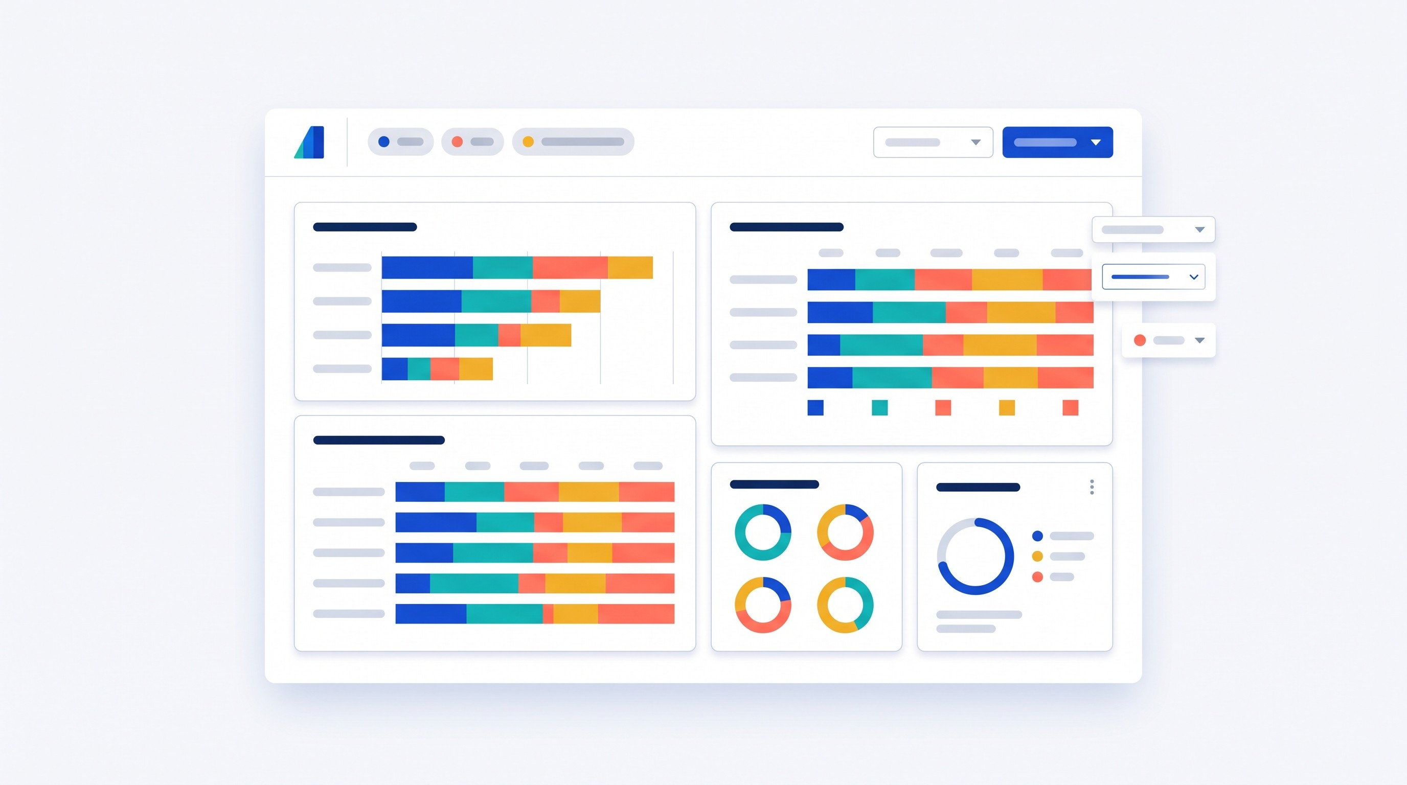
Tableau is best for interactive dashboards that let stakeholders filter responses by demographic group, region, product segment, wave, or respondent type. It is strong for exploratory presentation when users need to slice results without asking the analyst for a new chart each time.
Use Tableau when the audience wants to interact with findings: filter satisfaction by customer tier, compare Likert distributions across departments, or drill into regional differences. It is also useful for recurring reporting when the source data is refreshed.
Polished dashboards can still be wrong. If response categories are inconsistent, calculated fields are poorly defined, or missing values are hidden, Tableau will display the problem beautifully.
16. Microsoft Power BI
Microsoft Power BI is best for organizations already using Microsoft data services and needing shareable dashboards with reusable data models. It fits survey reporting that connects to Excel, SharePoint, SQL Server, Azure, Teams, or Microsoft 365 distribution.
Power BI is strongest when the model is designed carefully: separate respondent-level data, question metadata, lookup tables, calculated measures, and row-level permissions where needed. That structure prevents a dashboard from becoming a pile of disconnected visuals.
The biggest survey risk is denominator confusion. Make sure each percentage clearly reflects the right base: all invited respondents, completed responses, valid answers for that item, or a weighted count.
17. Looker Studio
Looker Studio is best for lightweight, browser-based reporting and sharing when the underlying data already lives in compatible cloud sources. It is useful for simple dashboards built from prepared Google Sheets, BigQuery tables, or marketing/customer data sources.
Choose it when the reporting need is modest: a few trend charts, response counts, top-line distributions, and filters. It is easy to share and accessible to nontechnical collaborators.
Do not use it as the main cleaning or statistical environment. Complex survey transformations, inferential analysis, and advanced quality checks belong upstream.
18. Flourish
Flourish is best for quickly creating presentation-ready charts and interactive storytelling from prepared survey summaries. It is useful for public reports, slide decks, journalism-style explainers, and stakeholder narratives.
Use Flourish after the analysis is complete. Feed it summarized tables with clear labels, not messy respondent-level exports. It can make Likert distributions, ranking charts, maps, and interactive stories easier to understand.
Its limitation is the same as every visualization layer: it cannot validate the analysis. It shows what you give it.
For a wider view of charting and dashboard options, see Otio’s guide to research data visualization tools.
A practical survey data cleaning and analysis workflow
The tool stack matters less than the audit trail. A defensible survey workflow makes it possible to explain what changed between raw responses and final findings.

1. Preserve the raw export
Save the original file exactly as exported. Do not rename columns, delete rows, or fix labels in place.
Create a data dictionary that records question wording, response codes, skip logic, survey wave, weighting variables, and any embedded metadata. If the survey came from Qualtrics or SurveyMonkey, export both the respondent data and the structure/codebook if available.
2. Profile the file before editing
Before recoding anything, inspect the dataset. Look for:
Column types that imported incorrectly
Impossible values
Duplicate respondent IDs
Straight-line responses
Very short completion times
Missingness by item and respondent
Inconsistent labels
Open-ended answers that need coding
Skip-logic violations
Weight variables with extreme values
This first pass prevents premature cleaning. Some “errors” are meaningful: a skipped answer may reflect survey logic, not nonresponse.
3. Separate cleaning from interpretation
Cleaning decisions should not quietly encode the conclusion. Decide in advance how to handle invalid responses, partial completes, attention-check failures, duplicate records, and missing values.
For each decision, document whether the response was removed, recoded as missing, retained, or included only in a sensitivity analysis. This is especially important when exclusions change sample size or group balance.
4. Use reproducible transformations when the file may change
If the dataset will be updated, audited, or reused, avoid one-off manual edits. Use a script, Power Query workflow, OpenRefine operation history, or another repeatable process.
For AI-assisted review, Otio’s spreadsheet AI workflow can help inspect CSVs, summarize patterns, and produce exploratory charts. Every recode, exclusion, and statistical conclusion still needs to be checked in the primary analysis tool.
This is the right division of labor: AI can speed inspection and explanation; the final rules belong in a documented workflow.
5. Export analysis-ready data and a codebook
Before building charts, export a clean dataset and a codebook. The codebook should include variable names, labels, response codes, derived variables, exclusions, weighting notes, and missing-data conventions.
Then build analysis outputs with denominators clearly labeled. For every chart or table, specify whether counts are weighted or unweighted, whether missing responses are excluded, and what uncertainty is shown where relevant.
A chart labeled “62% agree” is incomplete unless the reader knows 62% of whom.
FAQ
Q: What is the best free tool for cleaning survey data?
A: OpenRefine is a strong free option for inconsistent text values and duplicate-like records. Python with pandas or R with tidyverse is better for repeatable, more complex pipelines if you are comfortable with code.
Q: Can AI clean survey data automatically?
A: AI can help identify suspicious values, summarize patterns, and suggest transformations, but it should not silently remove respondents or redefine variables. Keep the raw file, review every change, and record the final cleaning rules.
Q: How should I analyze Likert-scale survey responses?
A: Start with response distributions, missingness, and clearly labeled frequencies or percentages. For comparisons or modeling, choose methods based on the research design, scale treatment, sample size, weighting, and assumptions.
Q: Should I use SPSS, R, or Python for survey analysis?
A: SPSS is often the quickest route for menu-driven analysis, while R and Python are stronger for reproducibility, automation, and customized workflows. Choose based on the analyses required, team skills, documentation needs, and whether the dataset will be processed repeatedly.
[[OTIO_FOOTER_PROMO:%7B%22title%22%3A%22Compare%20your%20survey%20sources%20before%20reporting%22%2C%22description%22%3A%22Add%20your%20export%2C%20codebook%2C%20methods%20notes%2C%20and%20related%20reports%20to%20Otio%2C%20then%20ask%20cited%20questions%20across%20them%20before%20publishing%20findings.%22%7D]]